Data Visualization Examples
The 10 Best Modern Visualizations
Photo credit: Kostiantyn Kucher and Andreas Kerren
- How Eggs Get Their Shape
- How the Recession Reshaped the Economy
- How Americans Eat
- How State Populations Have Shifted
- How the Wind is Blowing
- How the Pandemic Increased Poverty
- How Billboard’s Top Hits Changed
- How Gender Affects Pay
- How Every Member Got to Congress
- How Cryptocurrency Drives GPU Prices
Data visualization is the portrayal of data in charts, graphs, maps and other visual formats to help you identify trends and relationships in your data. As you’ll see in the ten data visualization examples below, a well-done chart can turn huge datasets into clear stories on any topic, from food to music to politics.
More Resources:
- Practical advice in our Data Visualization Guide
- See how analysts compare top data visualization tools
1. How Eggs Get Their Shape
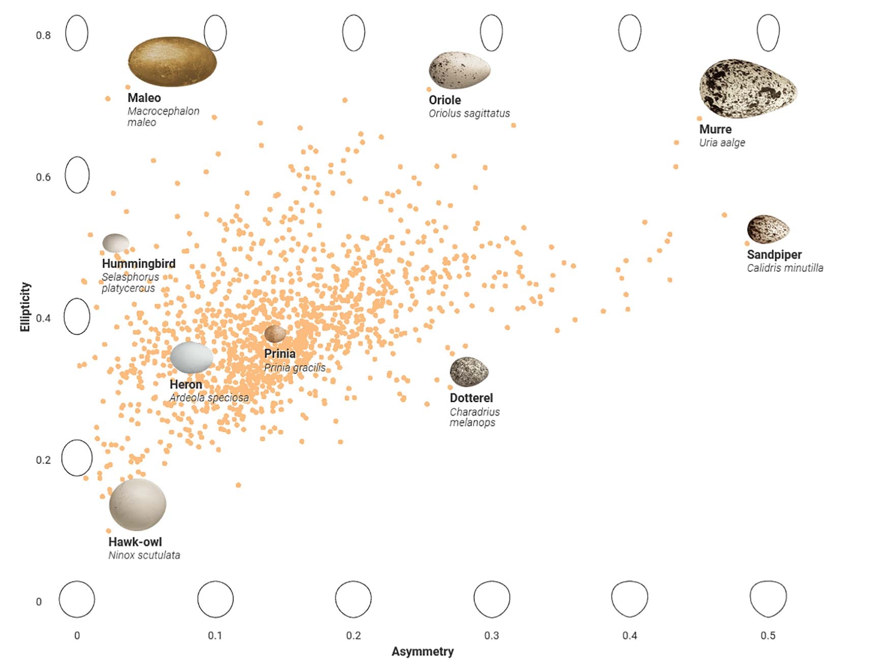
Visualization source: Science
Scientists have recently figured out why different kinds of birds have different shapes for their eggs. This study compiled data on almost 50,000 bird eggs collected over the past 100 years. Egg dimensions were mapped to 1,400 species and this chart shows the relationship between asymmetry (pointiness) and ellipticity (deviation from a perfect sphere).
2. How the Recession Reshaped the Economy
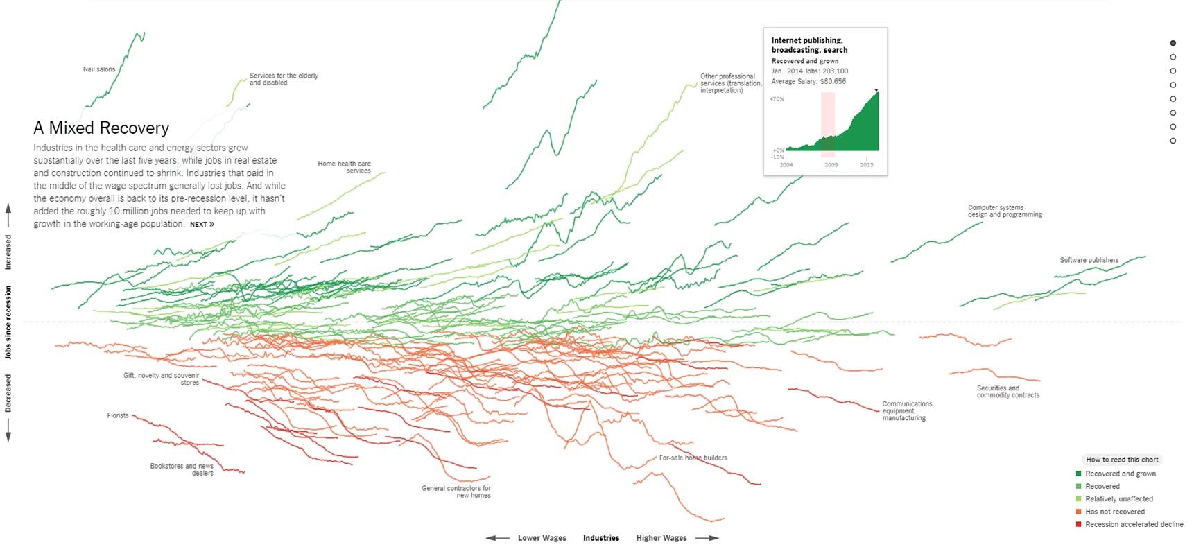
Visualization source: New York Times
This interactive chart shows how different industries performed after the Great Recession in the US. Each line represents the change in the number of jobs for an industry over a 10 year period. Users can scroll through this visualization example to see breakouts of how the recession affected jobs in each industry, such as medical, housing and energy.
3. How Americans Eat
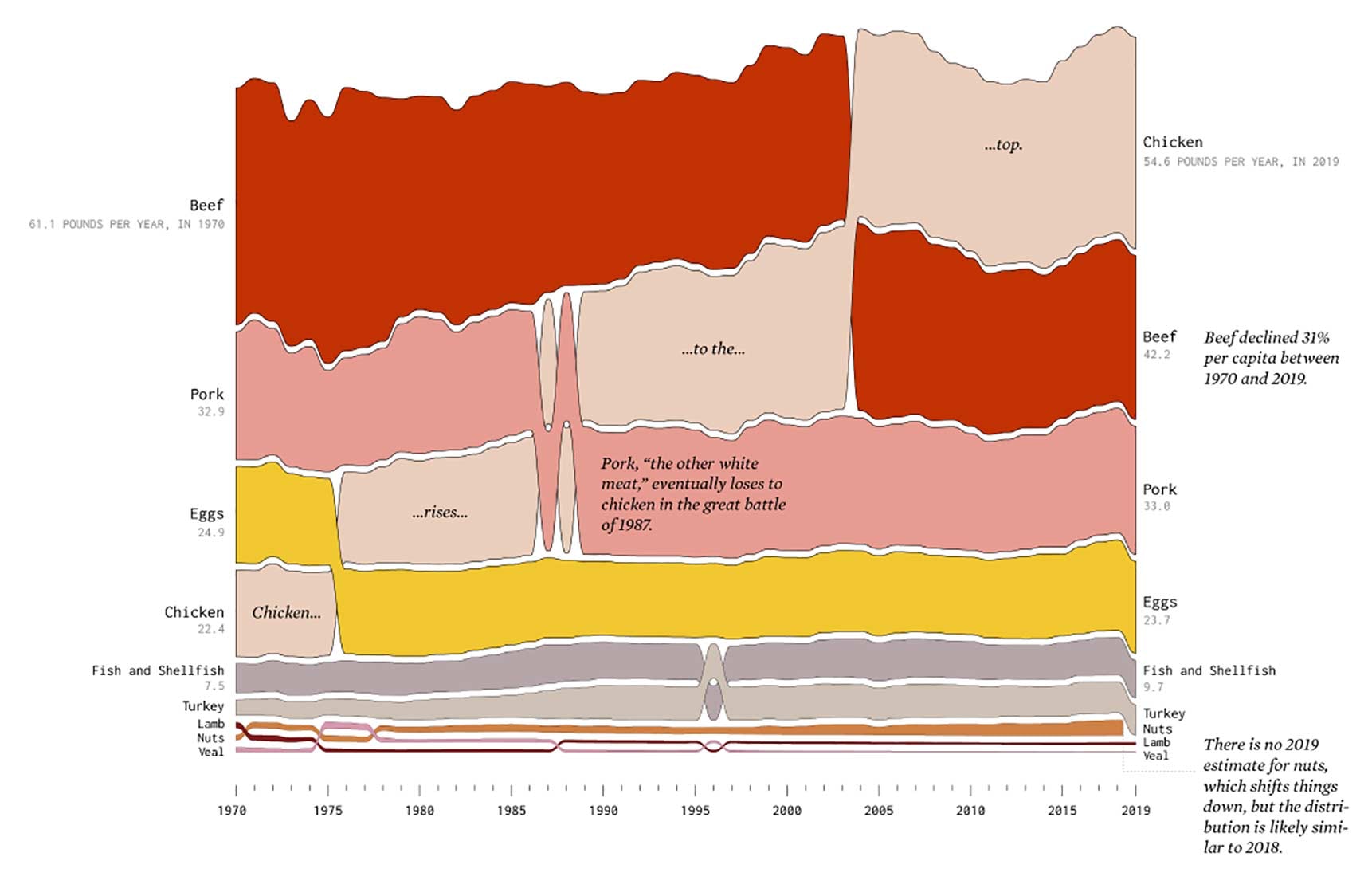
Visualization source: Flowing Data
This data visualization example uses data on food availability from the USDA to estimate and visualize how Americans eat nationally. The chart above shows how the pounds eaten per year per capita of key sources of protein has changed from 1970 to 2019.
4. How State Populations Have Shifted
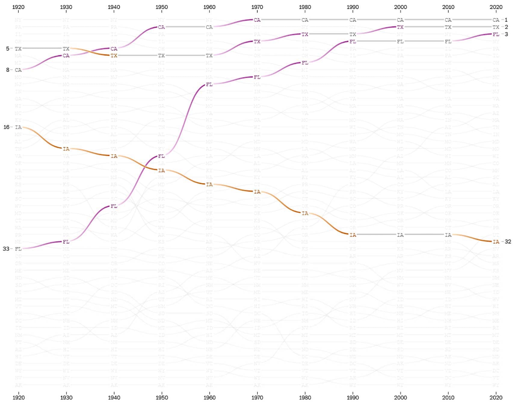
Visualization source: Washington Post
This interactive chart shows the ranking of each US state in terms of population for each decade since 1920. You can isolate individual states to easily see how they increase or decrease in rank over time.
5. How the Wind is Blowing
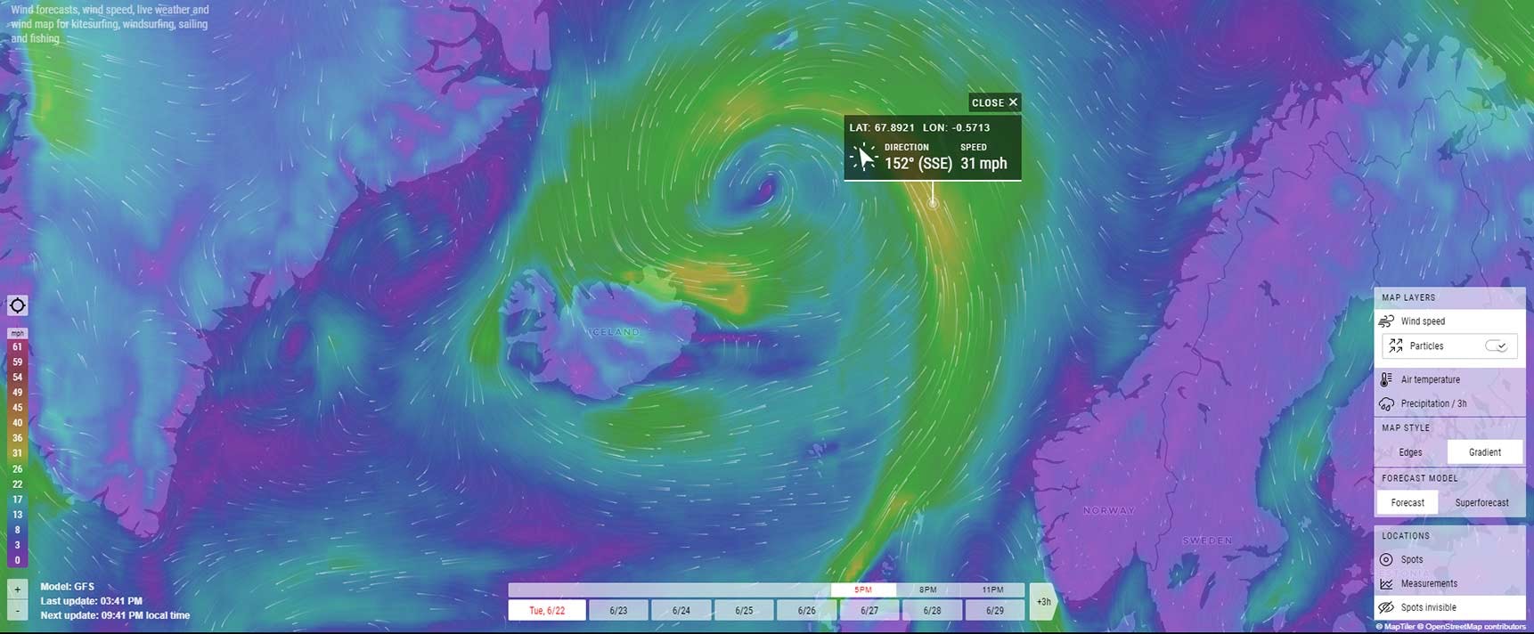
Visualization source: Windfinder
The windfinder wind map visualizes data from 21,000 weather stations worldwide to give you an immediate sense of live wind speed and direction, wind forecasts, and other weather conditions. Originally designed for kitesurfers, windsurfers, surfers, sailors and paragliders, anyone can zoom in on this mesmerizing map to see the conditions in their area.
6. How the Pandemic Increased Poverty
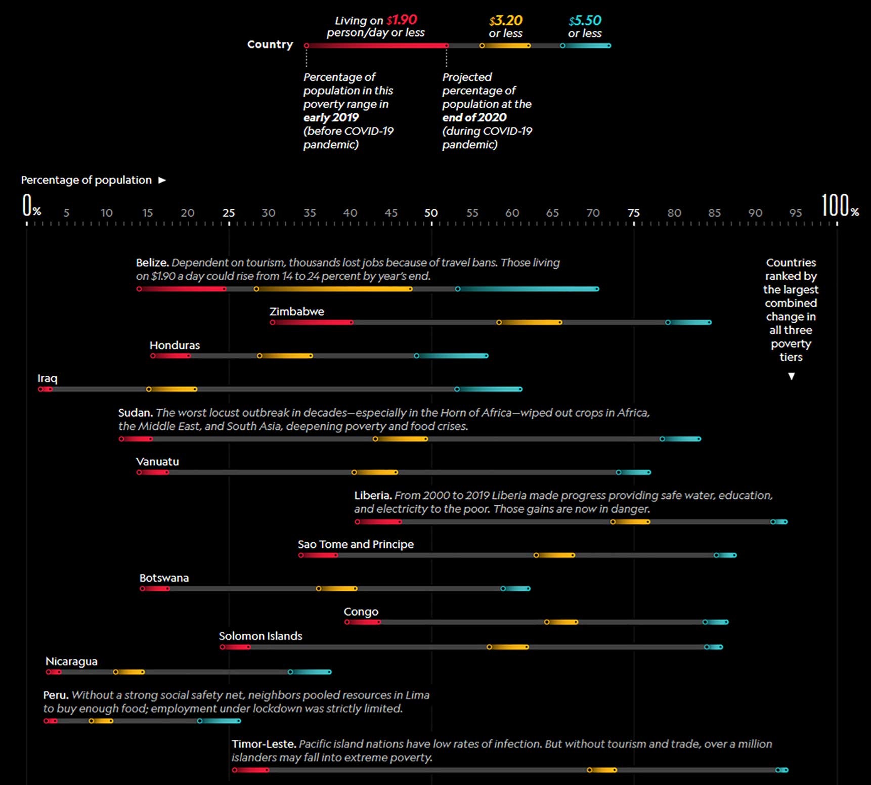
Visualization source: National Geographic
This data visualization example uses color and placement to help you understand a complex and dire story. Specifically, this presents the crippling effects of the COVID-19 pandemic on the world’s poorest countries. The colored bars show a country’s increases in poverty rates from before and after the pandemic.
7. How Billboard’s Top Hits Changed
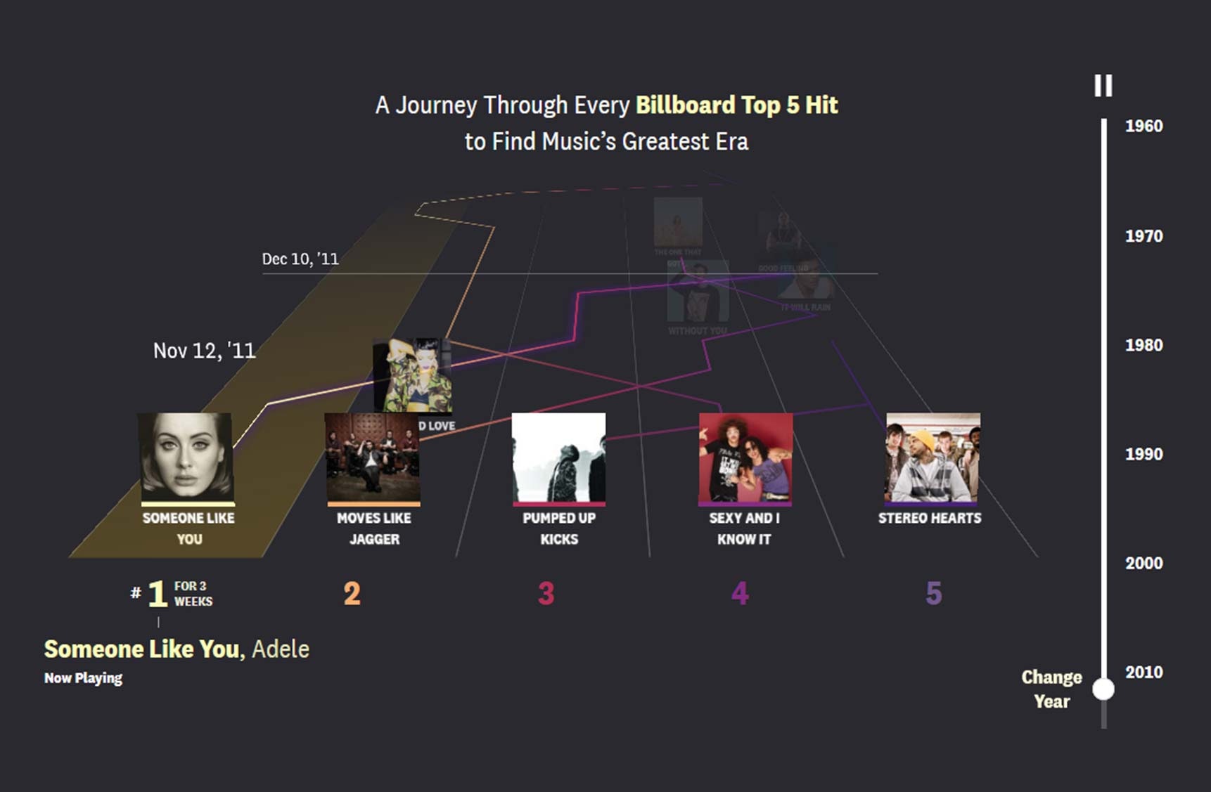
Visualization source: The Pudding
Music has changed so much over the decades and there are so many artists and genres to keep track of. This interactive visualization shows the top five songs every week from 1960 to 2019 and makes it easy for you to explore different time periods and even listen to the music as you do.
8. How Gender Affects Pay
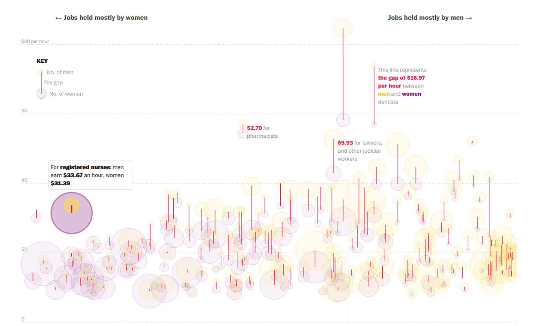
Visualization source: Washington Post
The pay gap between men and women varies by job as represented by the length of the red lines above. This outstanding visualization, based on self-reported data from 500,000 people, also uses different sized circles to show the number of women or men holding particular jobs.
9. How Every Member Got to Congress
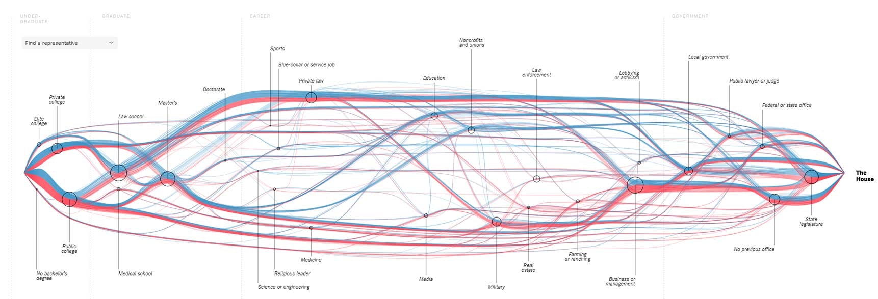
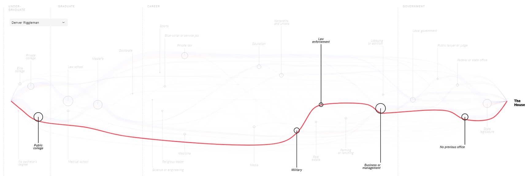
Visualization source: New York Times
This interactive data visualization example allows you to select a representative to the US Congress and see the path they took to get there. Blue lines represent Democratic members, red lines Republican and the circles show major milestones.
10. How Cryptocurrency Drives GPU Prices
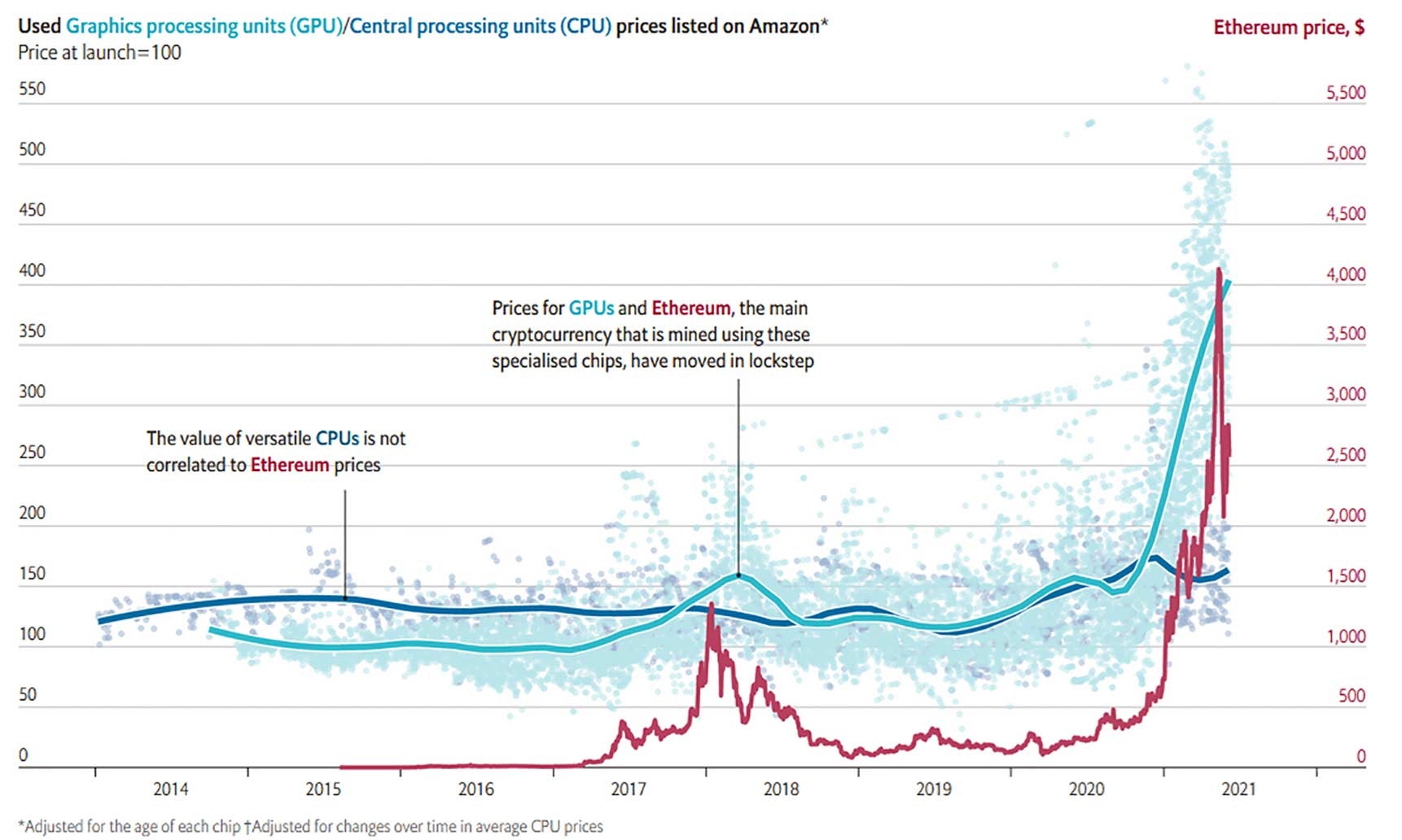
Visualization source: The Economist
This chart highlights the correlation between prices for the cryptocurrency Ethereum, shown in red, and graphics processing units (GPUs), shown in teal. The insight is that crypto-miners need GPU chips but not regular CPU chips, which is why GPU prices have skyrocketed right along with demand for Etherium while CPU prices have held steady.
Learn More About Data Visualization


Take visual analytics to a whole new level with Qlik
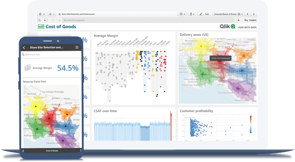
Compare Qlik Sense® to other data visualization tools and you'll see why Qlik takes data visualization to a whole new level.
- Easily combine, load, visualize, and explore your data, no matter how large (or small).
- Smart visualizations reveal the shape of your data and pinpoint outliers.
- Every chart, table, and object is interactive and instantly updates to the current context with each action.
- Get insights faster with assistance from Insight Advisor for chart creation, association recommendations, and data preparation.